Card
Flexible surface container for grouping related content, media, and actions.
Import
<script setup lang="ts">
import { Card, CardContent, CardDescription, CardFooter, CardHeader, CardTitle } from '@rysinal/heroui-vue'
</script>
Usage
Default
Become an Acme Creator!
Visit the Acme Creator Hub to sign up today and start earning credits from your fans and followers.
<template>
  <Card class="demo-card-standard">
    <DollarIcon class="demo-card-icon" />
    <CardHeader>
      <CardTitle>Become an Acme Creator!</CardTitle>
      <CardDescription>
        Visit the Acme Creator Hub to sign up today and start earning credits from your fans and followers.
      </CardDescription>
    </CardHeader>
    <CardFooter>
      <Link
        aria-label="Go to Acme Creator Hub"
        href="https://heroui.com"
        rel="noopener noreferrer"
        target="_blank"
      >
        Creator Hub
        <LinkIcon />
      </Link>
    </CardFooter>
  </Card>
</template>

<script setup lang="ts">
import { defineComponent, h } from 'vue'
import { Card, CardDescription, CardFooter, CardHeader, CardTitle, Link, LinkIcon } from '@rysinal/heroui-vue'

const DollarIcon = defineComponent({
  setup() {
    return () =>
      h(
        'svg',
        {
          viewBox: '0 0 24 24',
          fill: 'none',
          stroke: 'currentColor',
          'stroke-width': '2',
          'stroke-linecap': 'round',
          'stroke-linejoin': 'round',
          'aria-label': 'Dollar sign icon',
          role: 'img',
        },
        [
          h('path', { d: 'M12 2v20' }),
          h('path', { d: 'M17 5H9.5a3.5 3.5 0 0 0 0 7H14a3.5 3.5 0 0 1 0 7H6' }),
          h('circle', { cx: '12', cy: '12', r: '10' }),
        ],
      )
  },
})
</script>

<style lang="less">
.demo-card-standard {
  width: min(100%, 25rem);
  text-align: left;
}

.demo-card-icon {
  width: 1.5rem;
  height: 1.5rem;
  color: var(--color-accent);
}
</style>
Anatomy
<template>
  <Card>
    <CardHeader>
      <CardTitle />
      <CardDescription />
    </CardHeader>
    <CardContent />
    <CardFooter />
  </Card>
</template>
Variants
Transparent
Minimal prominence with transparent background
Use for less important content or nested cards
Default
Standard card appearance
The default card variant for most use cases
Secondary
Medium prominence
Use to draw moderate attention
Tertiary
Higher prominence
Use for primary or featured content
<template>
  <div class="demo-card-stack">
    <Card
      v-for="item in variants"
      :key="item.variant"
      :variant="item.variant"
    >
      <CardHeader>
        <CardTitle>{{ item.title }}</CardTitle>
        <CardDescription>{{ item.description }}</CardDescription>
      </CardHeader>
      <CardContent>
        <p>{{ item.content }}</p>
      </CardContent>
    </Card>
  </div>
</template>

<script setup lang="ts">
import { Card, CardContent, CardDescription, CardHeader, CardTitle } from '@rysinal/heroui-vue'

const variants = [
  {
    variant: 'transparent',
    title: 'Transparent',
    description: 'Minimal prominence with transparent background',
    content: 'Use for less important content or nested cards',
  },
  {
    variant: 'default',
    title: 'Default',
    description: 'Standard card appearance',
    content: 'The default card variant for most use cases',
  },
  {
    variant: 'secondary',
    title: 'Secondary',
    description: 'Medium prominence',
    content: 'Use to draw moderate attention',
  },
  {
    variant: 'tertiary',
    title: 'Tertiary',
    description: 'Higher prominence',
    content: 'Use for primary or featured content',
  },
] as const
</script>

<style lang="less">
.demo-card-stack {
  display: flex;
  width: min(100%, 24rem);
  flex-direction: column;
  gap: 1rem;
  text-align: left;
}
</style>
Horizontal Layout
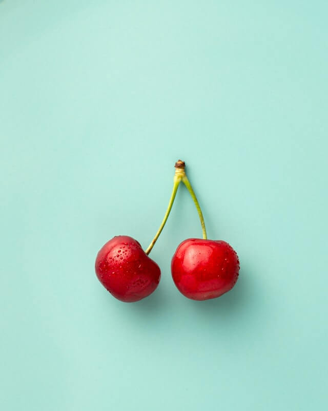
Become an ACME Creator!
Lorem ipsum dolor sit amet consectetur. Sed arcu donec id aliquam dolor sed amet faucibus etiam.
<template>
  <Card class="demo-card-horizontal">
    <div class="demo-card-media-frame">
      <img
        alt="Cherries"
        class="demo-card-image"
        loading="lazy"
        src="https://heroui-assets.nyc3.cdn.digitaloceanspaces.com/docs/cherries.jpeg"
      />
    </div>
    <div class="demo-card-horizontal-inner">
      <CardHeader class="demo-card-header">
        <CardTitle class="demo-card-title-offset">Become an ACME Creator!</CardTitle>
        <CardDescription>
          Lorem ipsum dolor sit amet consectetur. Sed arcu donec id aliquam dolor sed amet faucibus etiam.
        </CardDescription>
        <CloseButton aria-label="Close banner" class="demo-card-close" />
      </CardHeader>
      <CardFooter class="demo-card-footer-split">
        <div class="demo-card-meta">
          <span class="demo-card-meta-title">Only 10 spots</span>
          <span class="demo-card-meta-muted">Submission ends Oct 10.</span>
        </div>
        <Button>Apply Now</Button>
      </CardFooter>
    </div>
  </Card>
</template>

<script setup lang="ts">
import { Button, Card, CardDescription, CardFooter, CardHeader, CardTitle, CloseButton } from '@rysinal/heroui-vue'
</script>

<style lang="less">
.demo-card-horizontal {
  width: 100%;
  max-width: 42rem;
  min-height: 9.5rem;
  align-items: stretch;
  flex-direction: column;
}

.demo-card-horizontal-inner {
  display: flex;
  flex: 1;
  flex-direction: column;
  gap: 0.75rem;
}

.demo-card-media-frame {
  position: relative;
  width: 100%;
  height: 8.75rem;
  flex-shrink: 0;
  overflow: hidden;
  border-radius: 1rem;
}

.demo-card-image {
  position: absolute;
  inset: 0;
  width: 100%;
  height: 100%;
  transform: scale(1.25);
  object-fit: cover;
  user-select: none;
  pointer-events: none;
}

.demo-card-header {
  gap: 0.25rem;
}

.demo-card-title-offset {
  padding-right: 2rem;
}

.demo-card-footer-split {
  width: 100%;
  margin-top: auto;
  flex-direction: column;
  align-items: flex-start;
  justify-content: space-between;
  gap: 0.75rem;
}

.demo-card-close {
  position: absolute;
  top: 0.75rem;
  right: 0.75rem;
}

.demo-card-meta {
  display: flex;
  flex-direction: column;
  gap: 0.125rem;
}

.demo-card-meta-title {
  color: var(--color-foreground);
  font-size: 0.875rem;
  font-weight: 500;
}

.demo-card-meta-muted {
  color: var(--color-muted-foreground);
  font-size: 0.75rem;
}

@media (min-width: 640px) {
  .demo-card-horizontal {
    flex-direction: row;
  }

  .demo-card-media-frame {
    width: 7.5rem;
    height: 7.5rem;
  }

  .demo-card-footer-split {
    flex-direction: row;
    align-items: center;
  }

  .demo-card-footer-split [data-slot="button"] {
    width: auto;
  }
}
</style>
With Avatar

Indie Hackers
148 members
 M
M
AI Builders
362 members
 J
J<template>
<div class="demo-card-row">
<Card
v-for="community in communities"
:key="community.title"
class="demo-card-small"
>
<img
:alt="community.title"
class="demo-card-community-image"
loading="lazy"
:src="community.image"
/>
<CardHeader>
<CardTitle>{{ community.title }}</CardTitle>
<CardDescription>{{ community.members }} members</CardDescription>
</CardHeader>
<CardFooter class="demo-card-footer-inline">
<Avatar class="demo-card-author-avatar">
<AvatarImage
:alt="`${community.author} avatar`"
:src="community.avatar"
/>
<AvatarFallback>{{ community.author.slice(0, 1) }}</AvatarFallback>
</Avatar>
<span class="demo-card-meta-muted">By {{ community.author }}</span>
</CardFooter>
</Card>
</div>
</template>
<script setup lang="ts">
import { Avatar, AvatarFallback, AvatarImage, Card, CardDescription, CardFooter, CardHeader, CardTitle } from '@rysinal/heroui-vue'
const communities = [
{
title: 'Indie Hackers',
members: 148,
author: 'Martha',
image: 'https://heroui-assets.nyc3.cdn.digitaloceanspaces.com/docs/demo1.jpg',
avatar: 'https://heroui-assets.nyc3.cdn.digitaloceanspaces.com/avatars/red.jpg',
},
{
title: 'AI Builders',
members: 362,
author: 'John',
image: 'https://heroui-assets.nyc3.cdn.digitaloceanspaces.com/docs/demo2.jpg',
avatar: 'https://heroui-assets.nyc3.cdn.digitaloceanspaces.com/avatars/blue.jpg',
},
]
</script>
<style lang="less">
.demo-card-row {
display: flex;
flex-wrap: wrap;
align-items: stretch;
gap: 1rem;
text-align: left;
}
.demo-card-small {
width: 12.5rem;
gap: 0.5rem;
}
.demo-card-community-image {
width: 3.5rem;
height: 3.5rem;
border-radius: 1rem;
object-fit: cover;
}
.demo-card-footer-inline {
align-items: center;
gap: 0.5rem;
}
.demo-card-author-avatar {
width: 1.25rem;
height: 1.25rem;
}
.demo-card-meta-muted {
color: var(--color-muted-foreground);
font-size: 0.75rem;
}
</style>With Images
Become an ACME Creator!
Lorem ipsum dolor sit amet consectetur. Sed arcu donec id aliquam dolor sed amet faucibus etiam.
You can now withdraw on crypto
Add your wallet in settings to withdraw
JKIndie Hackers
148 members
JABAI Builders
362 members
M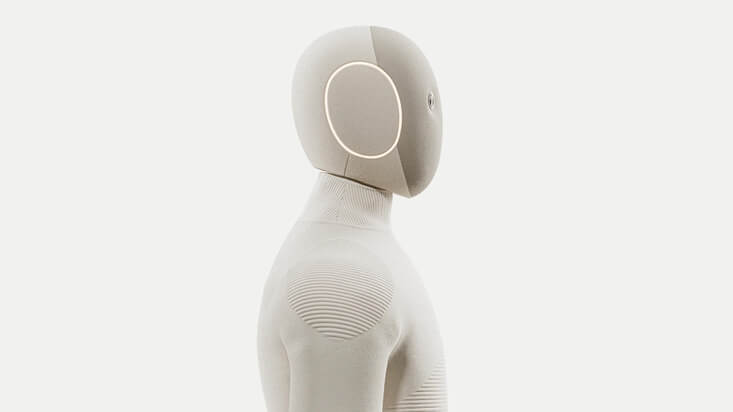
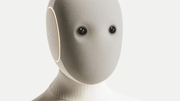
NEO
Home Robot

Bridging the Future
Today, 6:30 PM
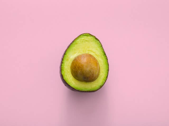
Avocado Hackathon
Wed, 4:30 PM

Sound Electro | Beyond art
Fri, 8:00 PM
<template>
  <div class="demo-card-images-shell">
    <div class="demo-card-images-grid">
      <Card class="demo-card-feature">
        <div class="demo-card-images-media-frame">
          <img
            alt="Cherries"
            class="demo-card-images-image"
            loading="lazy"
            src="https://heroui-assets.nyc3.cdn.digitaloceanspaces.com/docs/cherries.jpeg"
          />
        </div>
        <div class="demo-card-feature-body">
          <CardHeader class="demo-card-images-header">
            <CardTitle class="demo-card-images-title-offset">Become an ACME Creator!</CardTitle>
            <CardDescription>
              Lorem ipsum dolor sit amet consectetur. Sed arcu donec id aliquam dolor sed amet faucibus etiam.
            </CardDescription>
            <CloseButton aria-label="Close banner" class="demo-card-images-close" />
          </CardHeader>
          <CardFooter class="demo-card-images-footer-split">
            <div class="demo-card-images-meta">
              <span class="demo-card-images-meta-title">Only 10 spots</span>
              <span class="demo-card-images-meta-muted">Submission ends Oct 10.</span>
            </div>
            <Button class="demo-card-action">Apply Now</Button>
          </CardFooter>
        </div>
      </Card>

      <div class="demo-card-images-row">
        <div class="demo-card-left-column">
          <Card class="demo-card-payment">
            <div class="demo-card-close-wrap">
              <CloseButton aria-label="Close notification" />
            </div>
            <CardHeader class="demo-card-payment-header">
              <DollarIcon class="demo-card-payment-icon" />
              <div class="demo-card-payment-copy">
                <span class="demo-card-eyebrow">Payment</span>
                <CardTitle class="demo-card-images-title-offset demo-card-payment-title">
                  You can now withdraw on crypto
                </CardTitle>
                <CardDescription class="demo-card-payment-description">
                  Add your wallet in settings to withdraw
                </CardDescription>
              </div>
            </CardHeader>
            <CardFooter>
              <Link href="#" rel="noopener noreferrer" aria-label="Go to settings">
                Go to settings
                <LinkIcon aria-hidden="true" />
              </Link>
            </CardFooter>
          </Card>

          <div class="demo-card-community-grid">
            <Card
              v-for="community in communities"
              :key="community.title"
              class="demo-card-community"
            >
              <CardHeader>
                <Avatar class="demo-card-community-avatar">
                  <AvatarImage :alt="community.title" :src="community.image" />
                  <AvatarFallback>{{ community.fallback }}</AvatarFallback>
                </Avatar>
              </CardHeader>
              <CardContent class="demo-card-community-content">
                <p class="demo-card-community-title">{{ community.title }}</p>
                <p class="demo-card-community-members">{{ community.members }} members</p>
              </CardContent>
              <CardFooter class="demo-card-author">
                <Avatar class="demo-card-images-author-avatar">
                  <AvatarImage :alt="`${community.author} avatar`" :src="community.authorAvatar" />
                  <AvatarFallback>{{ community.author.slice(0, 1) }}</AvatarFallback>
                </Avatar>
                <p class="demo-card-author-text">By {{ community.author }}</p>
              </CardFooter>
            </Card>
          </div>
        </div>

        <Card class="demo-card-neo demo-card-neo-medium">
          <img
            alt="NEO Home Robot"
            aria-hidden="true"
            class="demo-card-cover-image"
            src="https://heroui-assets.nyc3.cdn.digitaloceanspaces.com/docs/neo2.jpeg"
          />
          <CardHeader class="demo-card-cover-header">
            <CardTitle class="demo-card-cover-title">NEO</CardTitle>
            <CardDescription class="demo-card-cover-description">Home Robot</CardDescription>
          </CardHeader>
          <CardFooter class="demo-card-cover-footer">
            <div>
              <div class="demo-card-cover-label">Available soon</div>
              <div class="demo-card-cover-muted">Get notified</div>
            </div>
            <Button class="demo-card-light-button" size="sm" variant="tertiary">Notify me</Button>
          </CardFooter>
        </Card>
      </div>

      <div class="demo-card-images-row">
        <Card class="demo-card-neo demo-card-neo-large">
          <img
            alt="NEO Home Robot"
            aria-hidden="true"
            class="demo-card-cover-image"
            src="https://heroui-assets.nyc3.cdn.digitaloceanspaces.com/docs/neo1.jpeg"
          />
          <CardFooter class="demo-card-cover-footer demo-card-cover-footer-bottom">
            <div>
              <div class="demo-card-hero-title">NEO</div>
              <div class="demo-card-hero-price">$499/m</div>
            </div>
            <Button class="demo-card-light-button" size="sm" variant="tertiary">Get now</Button>
          </CardFooter>
        </Card>

        <div class="demo-card-events">
          <Card
            v-for="event in events"
            :key="event.title"
            class="demo-card-event"
            variant="transparent"
          >
            <img
              :alt="event.alt"
              class="demo-card-event-image"
              loading="lazy"
              :src="event.image"
            />
            <div class="demo-card-event-copy">
              <CardTitle class="demo-card-event-title">{{ event.title }}</CardTitle>
              <CardDescription class="demo-card-event-time">{{ event.time }}</CardDescription>
            </div>
          </Card>
        </div>
      </div>
    </div>
  </div>
</template>

<script setup lang="ts">
import { defineComponent, h } from 'vue'
import {
  Avatar,
  AvatarFallback,
  AvatarImage,
  Button,
  Card,
  CardContent,
  CardDescription,
  CardFooter,
  CardHeader,
  CardTitle,
  CloseButton,
  Link,
  LinkIcon,
} from '@rysinal/heroui-vue'

const communities = [
  {
    title: 'Indie Hackers',
    members: 148,
    author: 'John',
    fallback: 'JK',
    image: 'https://heroui-assets.nyc3.cdn.digitaloceanspaces.com/docs/demo1.jpg',
    authorAvatar: 'https://heroui-assets.nyc3.cdn.digitaloceanspaces.com/avatars/red.jpg',
  },
  {
    title: 'AI Builders',
    members: 362,
    author: 'Martha',
    fallback: 'AB',
    image: 'https://heroui-assets.nyc3.cdn.digitaloceanspaces.com/docs/demo2.jpg',
    authorAvatar: 'https://heroui-assets.nyc3.cdn.digitaloceanspaces.com/avatars/blue.jpg',
  },
]

const events = [
  {
    title: 'Bridging the Future',
    time: 'Today, 6:30 PM',
    alt: 'Futuristic Robot',
    image: 'https://heroui-assets.nyc3.cdn.digitaloceanspaces.com/docs/robot1.jpeg',
  },
  {
    title: 'Avocado Hackathon',
    time: 'Wed, 4:30 PM',
    alt: 'Avocado',
    image: 'https://heroui-assets.nyc3.cdn.digitaloceanspaces.com/docs/avocado.jpeg',
  },
  {
    title: 'Sound Electro | Beyond art',
    time: 'Fri, 8:00 PM',
    alt: 'Sound Electro event',
    image: 'https://heroui-assets.nyc3.cdn.digitaloceanspaces.com/docs/oranges.jpeg',
  },
]

const DollarIcon = defineComponent({
  setup() {
    return () =>
      h(
        'svg',
        {
          viewBox: '0 0 24 24',
          fill: 'none',
          stroke: 'currentColor',
          'stroke-width': '2.25',
          'stroke-linecap': 'round',
          'stroke-linejoin': 'round',
          'aria-label': 'Dollar sign icon',
          role: 'img',
        },
        [
          h('circle', { cx: '12', cy: '12', r: '10' }),
          h('path', { d: 'M12 6v12' }),
          h('path', { d: 'M16 8.5H10.5a2.5 2.5 0 0 0 0 5H13.5a2.5 2.5 0 0 1 0 5H8' }),
        ],
      )
  },
})
</script>

<style lang="less">
.demo-card-images-shell {
  display: flex;
  width: 100%;
  align-items: center;
  justify-content: center;
}

.demo-card-images-grid {
  display: grid;
  width: 100%;
  max-width: 42rem;
  grid-template-columns: repeat(12, minmax(0, 1fr));
  gap: 1rem;
  padding: 1rem;
  text-align: left;
}

.demo-card-feature {
  grid-column: span 12 / span 12;
  min-height: 9.5rem;
  flex-direction: column;
}

.demo-card-feature-body {
  display: flex;
  flex: 1;
  flex-direction: column;
  gap: 0.75rem;
}

.demo-card-images-media-frame {
  position: relative;
  width: 100%;
  height: 8.75rem;
  flex-shrink: 0;
  overflow: hidden;
  border-radius: 1rem;
}

.demo-card-images-image {
  position: absolute;
  inset: 0;
  width: 100%;
  height: 100%;
  transform: scale(1.25);
  object-fit: cover;
  user-select: none;
  pointer-events: none;
}

.demo-card-images-header {
  gap: 0.25rem;
}

.demo-card-images-title-offset {
  padding-right: 2rem;
}

.demo-card-images-close {
  position: absolute;
  top: 0.75rem;
  right: 0.75rem;
}

.demo-card-close-wrap {
  position: absolute;
  z-index: 10;
  top: 0.75rem;
  right: 0.75rem;
}

.demo-card-images-footer-split {
  width: 100%;
  margin-top: auto;
  flex-direction: column;
  align-items: flex-start;
  justify-content: space-between;
  gap: 0.75rem;
}

.demo-card-action {
  width: 100%;
}

.demo-card-images-meta {
  display: flex;
  flex-direction: column;
}

.demo-card-images-meta-title,
.demo-card-cover-label,
.demo-card-community-title,
.demo-card-hero-title {
  color: var(--color-foreground);
  font-weight: 500;
}

.demo-card-images-meta-title {
  font-size: 0.875rem;
}

.demo-card-images-meta-muted,
.demo-card-cover-muted,
.demo-card-community-members,
.demo-card-author-text,
.demo-card-event-time {
  color: var(--color-muted-foreground);
  font-size: 0.75rem;
}

.demo-card-images-row {
  display: grid;
  grid-column: span 12 / span 12;
  grid-template-columns: repeat(12, minmax(0, 1fr));
  gap: 1rem;
}

.demo-card-left-column {
  display: grid;
  grid-column: span 12 / span 12;
  grid-template-columns: repeat(12, minmax(0, 1fr));
  gap: 1rem;
}

.demo-card-payment {
  grid-column: span 12 / span 12;
}

.demo-card-payment-header {
  gap: 0.75rem;
}

.demo-card-payment-icon {
  width: 2rem;
  height: 2rem;
  flex-shrink: 0;
  color: var(--color-foreground);
}

.demo-card-payment-copy {
  display: flex;
  min-width: 0;
  flex-direction: column;
  gap: 0.25rem;
}

.demo-card-eyebrow {
  color: var(--color-muted-foreground);
  font-size: 0.75rem;
  font-weight: 500;
  text-transform: uppercase;
}

.demo-card-payment-title {
  font-size: 0.875rem;
}

.demo-card-payment-description {
  font-size: 0.75rem;
}

.demo-card-community-grid {
  display: grid;
  grid-column: span 12 / span 12;
  grid-template-columns: repeat(12, minmax(0, 1fr));
  gap: 1rem;
}

.demo-card-community {
  grid-column: span 12 / span 12;
  gap: 0.5rem;
}

.demo-card-community-avatar {
  width: 3.5rem;
  height: 3.5rem;
  border-radius: 0.75rem;
}

.demo-card-community-content {
  margin-top: 0.25rem;
}

.demo-card-community-title {
  font-size: 0.875rem;
  line-height: 1rem;
}

.demo-card-author {
  align-items: center;
  gap: 0.5rem;
}

.demo-card-images-author-avatar {
  width: 1rem;
  height: 1rem;
}

.demo-card-neo {
  position: relative;
  grid-column: span 12 / span 12;
  overflow: hidden;
  border-radius: 1.5rem;
}

.demo-card-neo-medium {
  min-height: 12.5rem;
}

.demo-card-neo-large {
  height: 15.625rem;
}

.demo-card-cover-image {
  position: absolute;
  inset: 0;
  width: 100%;
  height: 100%;
  object-fit: cover;
}

.demo-card-cover-header,
.demo-card-cover-footer {
  position: relative;
  z-index: 1;
}

.demo-card-cover-title {
  color: rgb(0 0 0 / 70%);
  font-size: 0.75rem;
  font-weight: 600;
  letter-spacing: 0.025em;
}

.demo-card-cover-description {
  color: rgb(0 0 0 / 50%);
  font-size: 0.875rem;
  font-weight: 500;
  line-height: 1.25rem;
}

.demo-card-cover-footer {
  margin-top: auto;
  align-items: center;
  justify-content: space-between;
}

.demo-card-cover-footer-bottom {
  align-items: flex-end;
}

.demo-card-cover-label {
  color: #000;
  font-size: 0.875rem;
}

.demo-card-cover-muted {
  color: rgb(0 0 0 / 60%);
}

.demo-card-light-button {
  background: #fff;
  color: #000;
}

.demo-card-hero-title {
  color: #000;
  font-size: 1rem;
}

.demo-card-hero-price {
  color: rgb(0 0 0 / 50%);
  font-size: 0.75rem;
  font-weight: 500;
}

.demo-card-events {
  display: flex;
  grid-column: span 12 / span 12;
  flex-direction: column;
  gap: 0.5rem;
}

.demo-card-event {
  flex-direction: row;
  gap: 0.75rem;
  padding: 0.25rem;
}

.demo-card-event-image {
  width: 4rem;
  height: 4rem;
  flex-shrink: 0;
  border-radius: 0.75rem;
  object-fit: cover;
  user-select: none;
}

.demo-card-event-copy {
  display: flex;
  flex: 1;
  flex-direction: column;
  justify-content: center;
  gap: 0.25rem;
}

.demo-card-event-title {
  font-size: 0.875rem;
}

@media (min-width: 640px) {
  .demo-card-feature {
    flex-direction: row;
  }

  .demo-card-images-media-frame {
    width: 7.5rem;
    height: 7.5rem;
  }

  .demo-card-images-footer-split {
    flex-direction: row;
    align-items: center;
  }

  .demo-card-action {
    width: auto;
  }

  .demo-card-community {
    grid-column: span 6 / span 6;
  }

  .demo-card-event-image {
    width: 5rem;
    height: 5rem;
  }

  .demo-card-neo-large {
    height: 18.75rem;
  }

  .demo-card-hero-title {
    font-size: 1.125rem;
  }

  .demo-card-hero-price {
    font-size: 0.875rem;
  }
}

@media (min-width: 768px) {
  .demo-card-neo-large {
    grid-column: span 8 / span 8;
    height: 21.875rem;
  }

  .demo-card-events {
    grid-column: span 4 / span 4;
    justify-content: space-between;
    gap: 0;
    padding: 0.5rem 0;
  }
}

@media (min-width: 1024px) {
  .demo-card-left-column,
  .demo-card-neo-medium {
    grid-column: span 6 / span 6;
  }
}
</style>
With Form
Login
Enter your credentials to access your account
<template>
  <Card class="demo-card-form">
    <CardHeader>
      <CardTitle>Login</CardTitle>
      <CardDescription>Enter your credentials to access your account</CardDescription>
    </CardHeader>
    <form @submit.prevent="submitted = true">
      <CardContent>
        <div class="demo-card-form-fields">
          <TextField
            v-model="email"
            full-width
            label="Email"
            name="email"
            placeholder="email@example.com"
            type="email"
            variant="secondary"
          />
          <TextField
            v-model="password"
            full-width
            label="Password"
            name="password"
            placeholder="••••••••"
            type="password"
            variant="secondary"
          />
        </div>
      </CardContent>
      <CardFooter class="demo-card-form-footer">
        <Button class="demo-card-full-button" type="submit">Sign In</Button>
        <Link href="#">Forgot password?</Link>
        <span v-if="submitted" class="demo-card-meta-muted">Form submitted successfully.</span>
      </CardFooter>
    </form>
  </Card>
</template>

<script setup lang="ts">
import { ref } from 'vue'
import { Button, Card, CardContent, CardDescription, CardFooter, CardHeader, CardTitle, Link, TextField } from '@rysinal/heroui-vue'

const email = ref('')
const password = ref('')
const submitted = ref(false)
</script>

<style lang="less">
.demo-card-form {
  width: 32rem;
  max-width: 100%;
  text-align: left;
}

.demo-card-form-fields {
  display: flex;
  flex-direction: column;
  gap: 1rem;
}

.demo-card-form-footer {
  margin-top: 1rem;
  flex-direction: column;
  align-items: stretch;
  gap: 0.5rem;
}

.demo-card-form-footer [data-slot="link"] {
  align-self: center;
  justify-content: center;
  text-align: center;
}

.demo-card-full-button {
  width: 100%;
}

.demo-card-meta-muted {
  color: var(--color-muted-foreground);
  font-size: 0.75rem;
}
</style>
Accessibility
Cards are non-interactive surfaces by default. Add semantic roles or use an anchor/button wrapper when the entire card is interactive.
<template>
  <Card role="article" aria-labelledby="creator-card-title">
    <CardHeader>
      <CardTitle id="creator-card-title">Article Title</CardTitle>
    </CardHeader>
  </Card>
</template>
Styling
Passing Classes
<template>
  <Card class="border-2 border-blue-500">
    <CardHeader>
      <CardTitle>Custom Styled Card</CardTitle>
      <CardDescription>Custom colors applied</CardDescription>
    </CardHeader>
  </Card>
</template>
CSS Classes
| Class | Description |
|---|---|
.card | Base card container |
.card__header | Header section |
.card__title | Title text |
.card__description | Description text |
.card__content | Main content area |
.card__footer | Footer actions/content |
.card--transparent | Transparent variant |
.card--default | Default surface |
.card--secondary | Medium prominence surface |
.card--tertiary | High prominence surface |
API
Card Props
| Prop | Type | Default | Description |
|---|---|---|---|
variant | 'transparent' | 'default' | 'secondary' | 'tertiary' | 'default' | Semantic prominence variant |
class | string | undefined | Additional classes for the card root |
CardHeader Props
| Prop | Type | Default | Description |
|---|---|---|---|
class | string | undefined | Additional classes for the header |
CardTitle Props
| Prop | Type | Default | Description |
|---|---|---|---|
as | string | 'h3' | Element rendered for the title |
class | string | undefined | Additional classes for the title |
CardDescription Props
| Prop | Type | Default | Description |
|---|---|---|---|
as | string | 'p' | Element rendered for the description |
class | string | undefined | Additional classes for the description |
CardContent Props
| Prop | Type | Default | Description |
|---|---|---|---|
class | string | undefined | Additional classes for the content |
CardFooter Props
| Prop | Type | Default | Description |
|---|---|---|---|
class | string | undefined | Additional classes for the footer |
Slots
| Component | Slot | Description |
|---|---|---|
Card | default | Card sections and custom content |
CardHeader | default | Header content |
CardTitle | default | Title content |
CardDescription | default | Description content |
CardContent | default | Main content |
CardFooter | default | Footer content |